# required packages
library(tidyverse)
library(RColorBrewer)
library(cleanR)

# load raw data
basic_data <- cleanR::survey_data %>% # converting HDDS variables to numeric
mutate(across(starts_with("HDDS"), as.numeric))R Visualizations
R programming
Visualizations
ggplot2
This are some learning stuff for data visualization.
Create your own custom theme
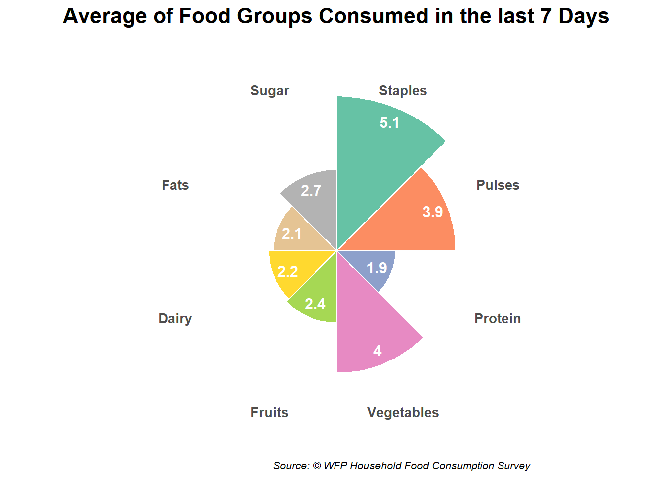
Chart 1: Circular Barplot
# Compute the average days
average_days <- basic_data |>
  summarise(across(
    .cols = c(FCSStap, FCSPulse, FCSPr, FCSVeg, FCSFruit, FCSDairy, FCSFat, FCSSugar),
    .fns = mean,
    na.rm = TRUE
  )) |>
  pivot_longer(cols = everything(), names_to = "food_group", values_to = "average_days")

# Create a nicer display name for each food group
average_days <- average_days |>
  mutate(
    food_group_clean = recode(food_group,
                              FCSStap = "Staples",
                              FCSPulse = "Pulses",
                              FCSPr = "Protein",
                              FCSVeg = "Vegetables",
                              FCSFruit = "Fruits",
                              FCSDairy = "Dairy",
                              FCSFat = "Fats",
                              FCSSugar = "Sugar"
    ),
    food_group_clean = factor(food_group_clean, levels = food_group_clean)
  )

# Create the circular barplot
ggplot(average_days, aes(x = food_group_clean, y = average_days, fill = food_group_clean)) +
  geom_bar(stat = "identity", width = 1, color = "white") +
  geom_text(
    aes(label = round(average_days, 1), y = average_days - 0.5),
    color = "white",
    size = 4,
    fontface = "bold"
  ) +
  coord_polar(start = 0) +
  scale_fill_brewer(palette = "Set2") +
  labs(
    title = "Average of Food Groups Consumed in the last 7 Days",
    subtitle = "",
    caption = "Source: © WFP Household Food Consumption Survey",
    x = NULL,
    y = NULL
  ) +
  theme_minimal() +
  theme(
    axis.text.y = element_blank(),
    axis.text.x = element_text(size = 10, face = "bold"),
    panel.grid = element_blank(),
    legend.position = "none",
    plot.title = element_text(size = 16, face = "bold", hjust = 0.5),
    plot.subtitle = element_text(size = 12, hjust = 0.5),
    plot.caption = element_text(size = 8, face = "italic", hjust = 1)
  )